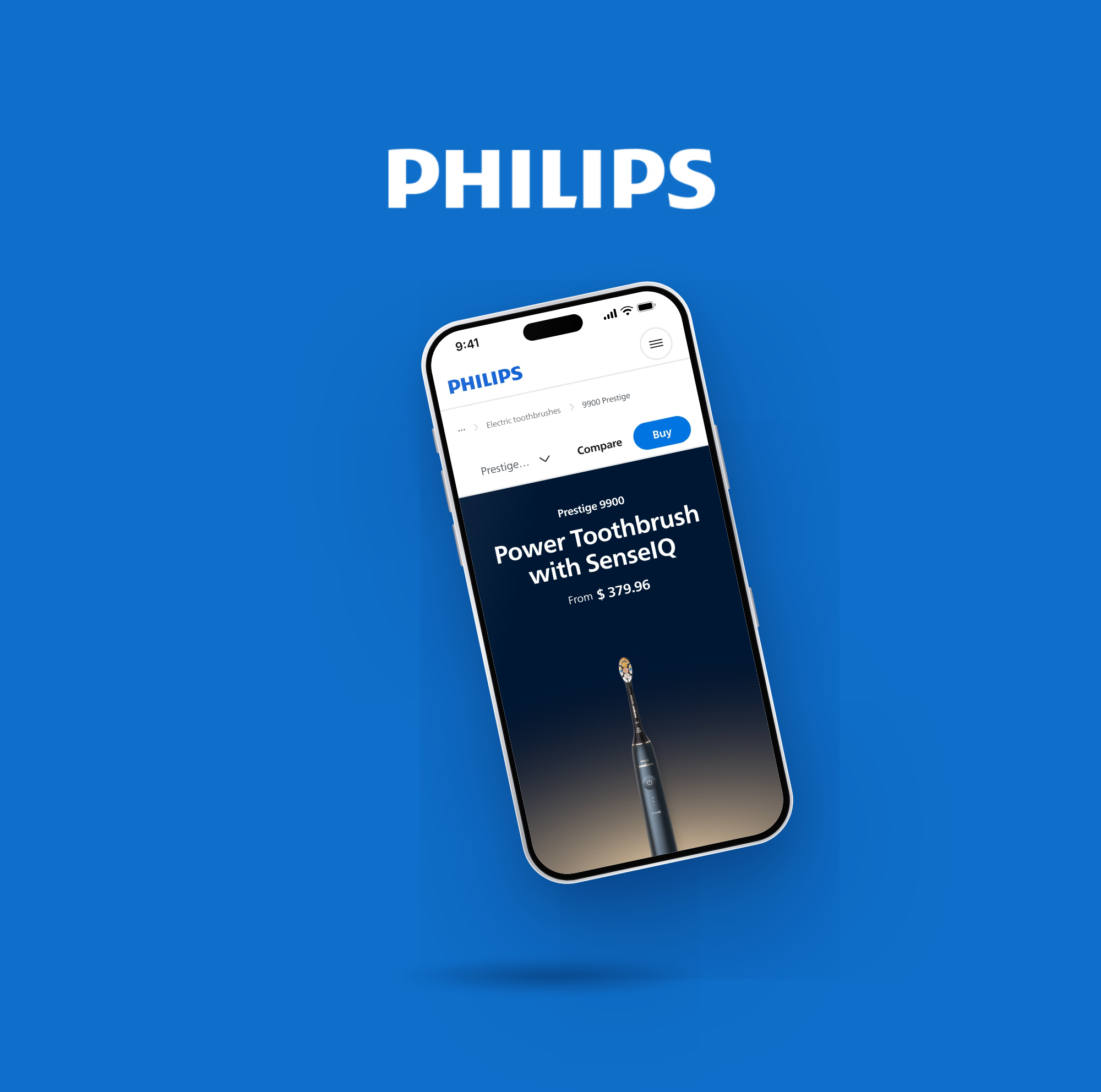
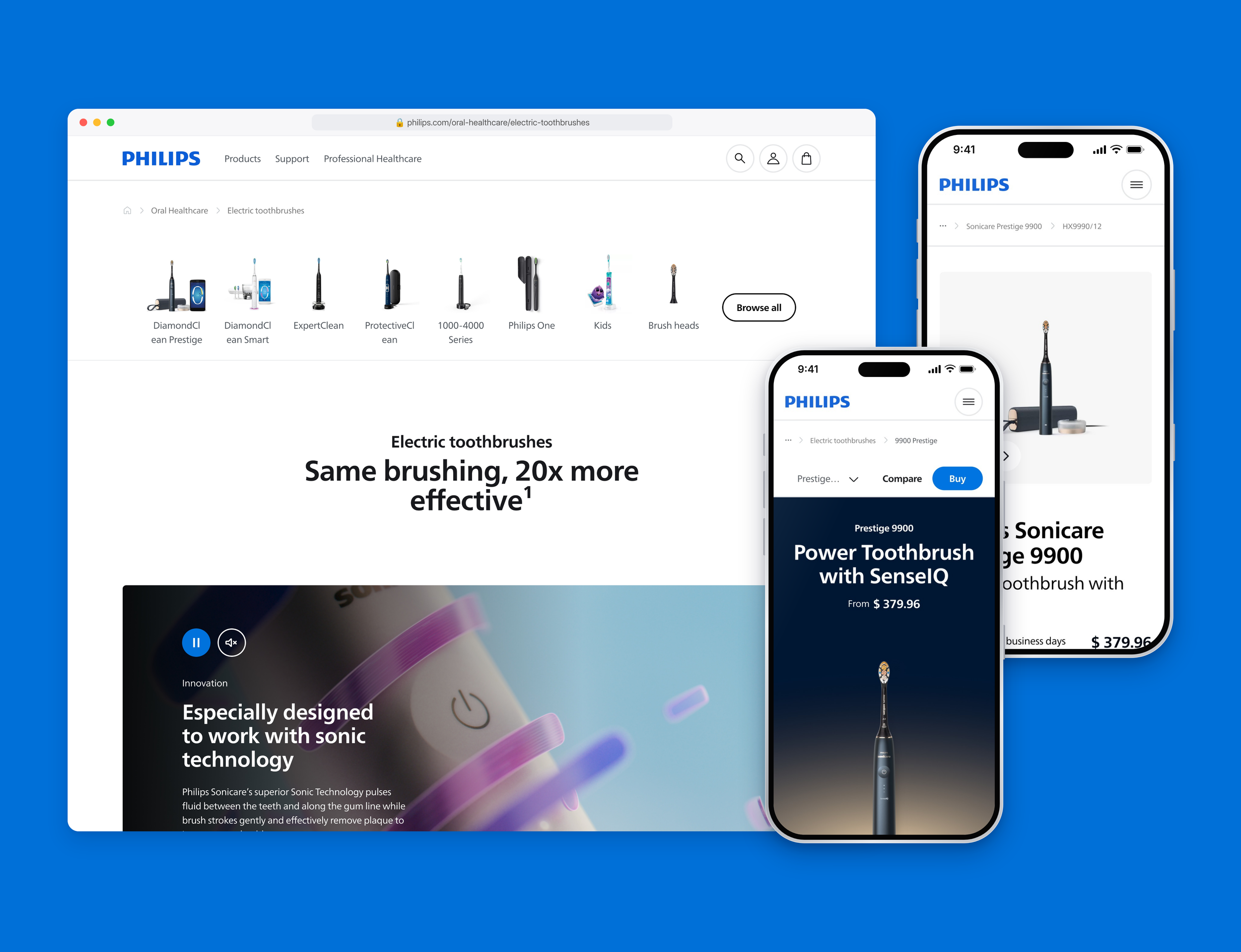
From October 2023 to April 2024 I worked as a Senior Product Designer on the redesign of Philips.com, freelance via code d’azur. Together with the team we rebuilt the website around one new design system, GenX, and a new e-commerce buy flow, validated step by step with user research and A/B testing.
Challenge
Philips.com grew per business unit, and every category told its own story. Pages and components differed per product line, ranges were hard to compare, technology like SenseIQ and SkinAI was hard to understand, and key information such as price was missing, especially on mobile. Right before the buy button, customers dropped off.
Goal:
One validated design system and a frictionless buy flow, measured on conversion, mobile conversion, bounce rate and order value.
My role
I was responsible for the explore page across all Philips business units, and for two business units end to end: toothbrushes (Philips Sonicare) and laser hair removal (Philips Lumea IPL). I was also responsible for the CRO of all new journeys we introduced: I tested every new GenX component with A/B tests on live traffic, and the winners were rolled out across the whole of Philips.com. Together with the team I co-created GenX, the new design system for Philips.com.
Approach
Google Design Sprints
We designed in Google Design Sprints: understand, sketch, decide, prototype and test, in one week. Every sprint ended with a user test, so we validated designs weekly with real customers before anything was built. Designs that passed went live as A/B tests, and only the winners were rolled out.
GenX design system
We rebuilt the design system around what customers need to choose and buy. Every component solves a real customer problem, supports a business goal and was validated with users before it went live. The result: one library of proven building blocks that every Philips business unit can use, so new pages are faster to build and consistent across the whole website.
Category page
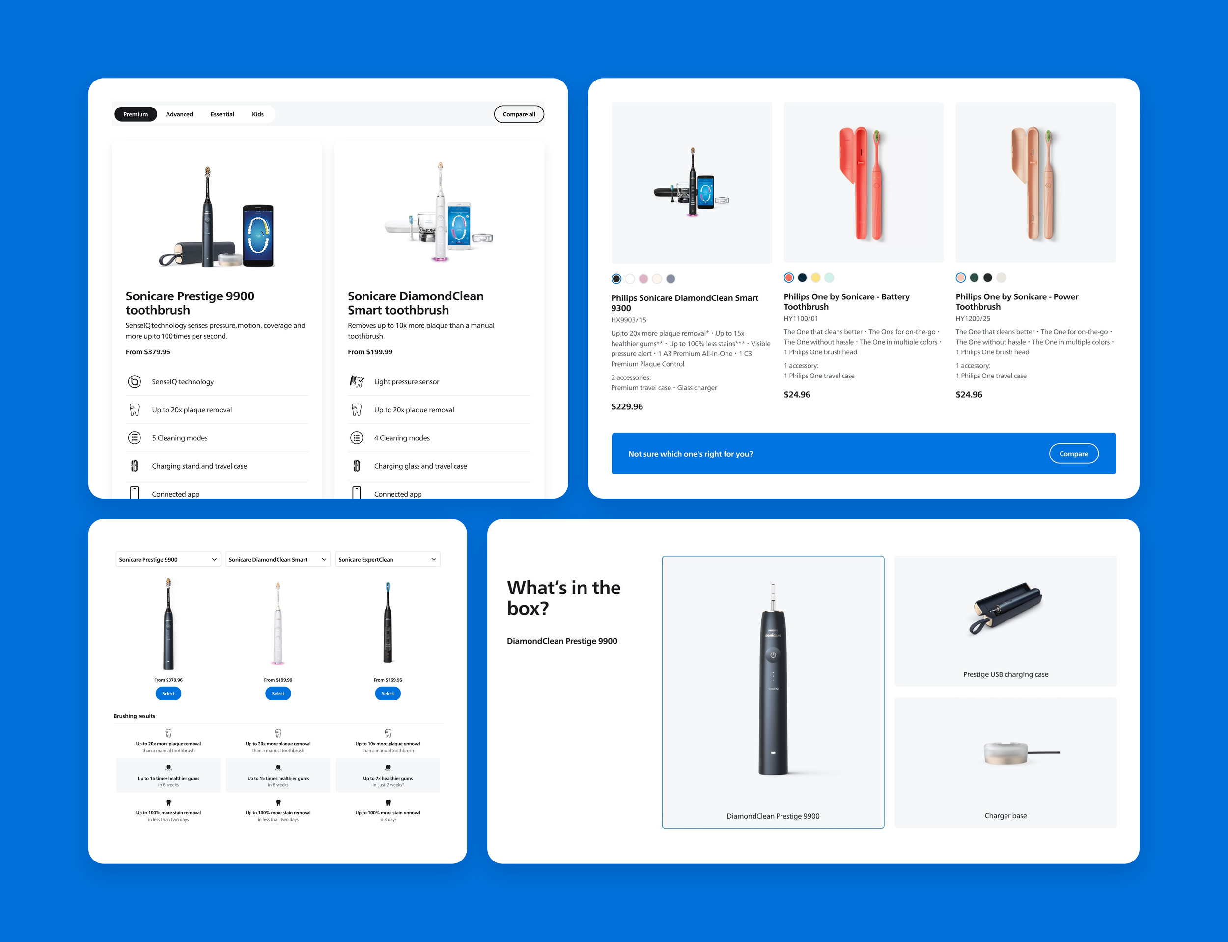
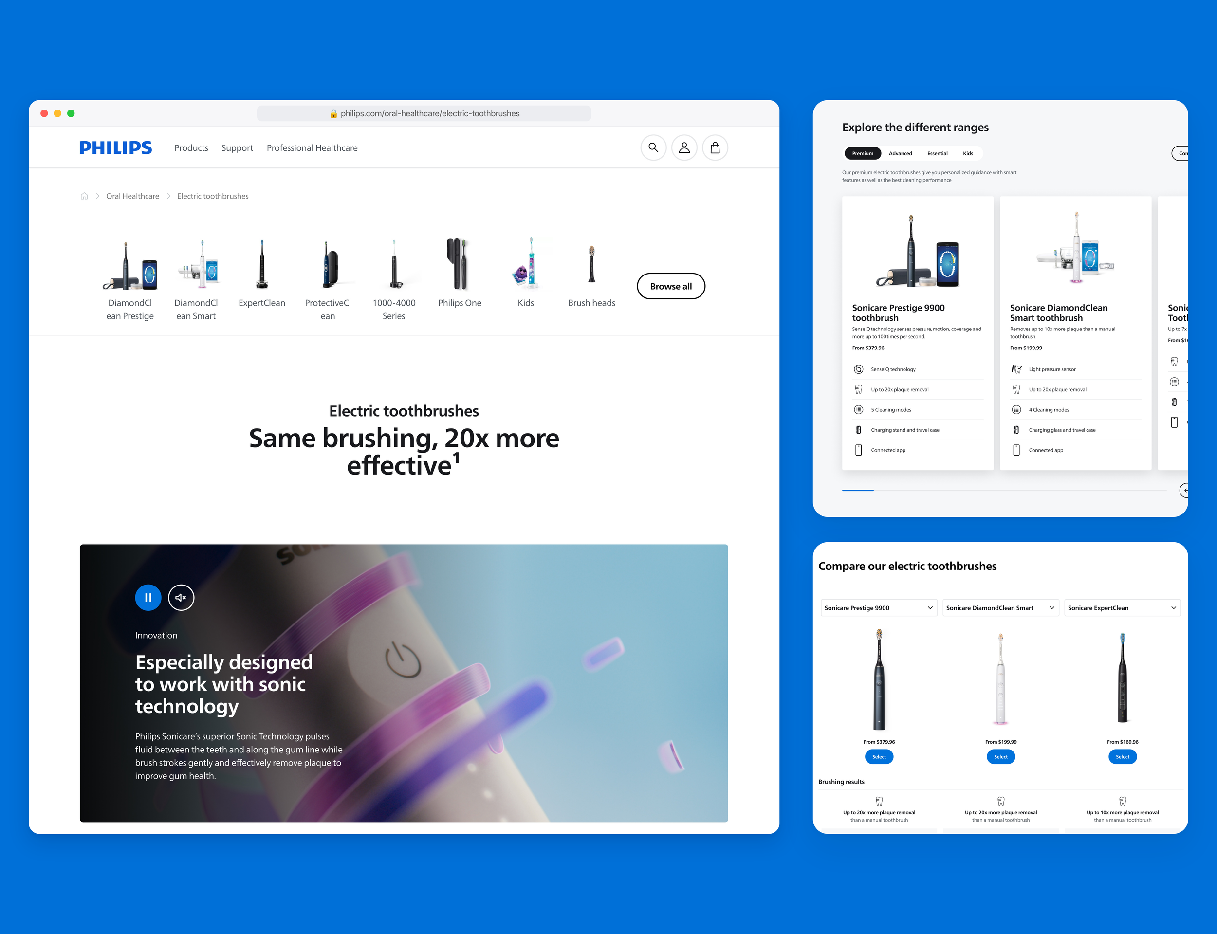
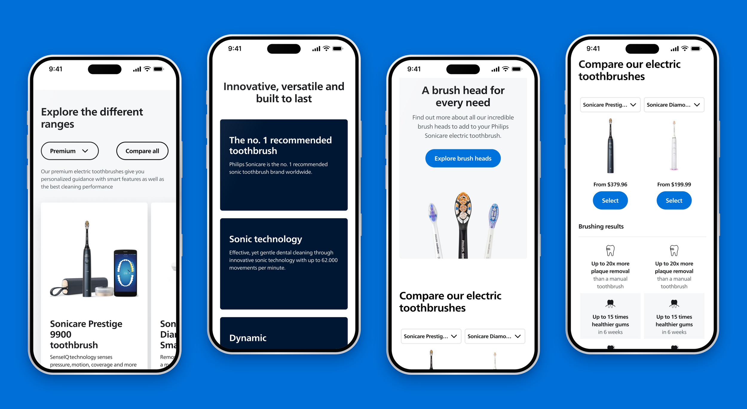
In user tests people struggled to tell the toothbrush ranges apart and had no easy way to compare them. We turned the category page into the place where customers choose: every range side by side with its key differences, proof behind every claim, and a compare table to settle the final doubt. Customers can find the right range on one page.
User research
Our first user test for toothbrushes ran with 6 participants on desktop and mobile. It showed us how people really choose a toothbrush:
Desktop users browse through the top navigation, mobile users rely on the range cards.
4 of 6 users wanted a range card to take them straight to the product page.
Users were sceptical about claims like “20x more plaque removal” without evidence.
SenseIQ came across as jargon without a clear explanation.
Pages felt too long on mobile, and users missed filters to sort by price.
Delivery costs and brush head compatibility were hard to find.
Every insight became a design change in the next sprint: proof next to every claim, technology explained in plain language, shorter pages and price on every card.
Explore page
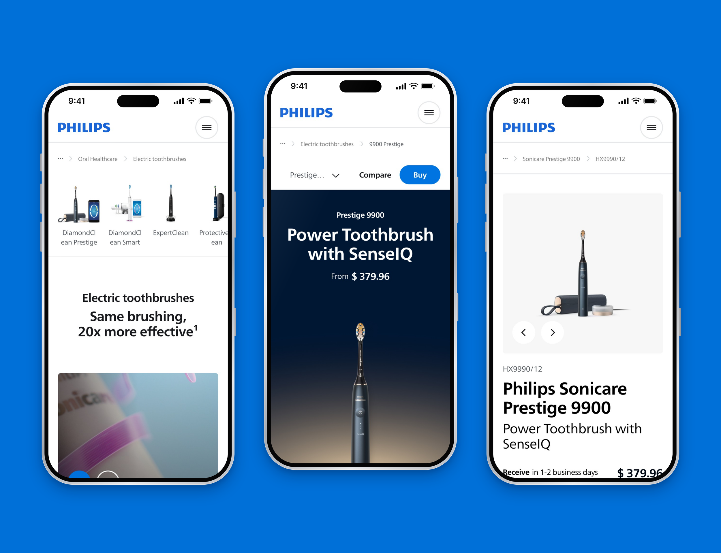
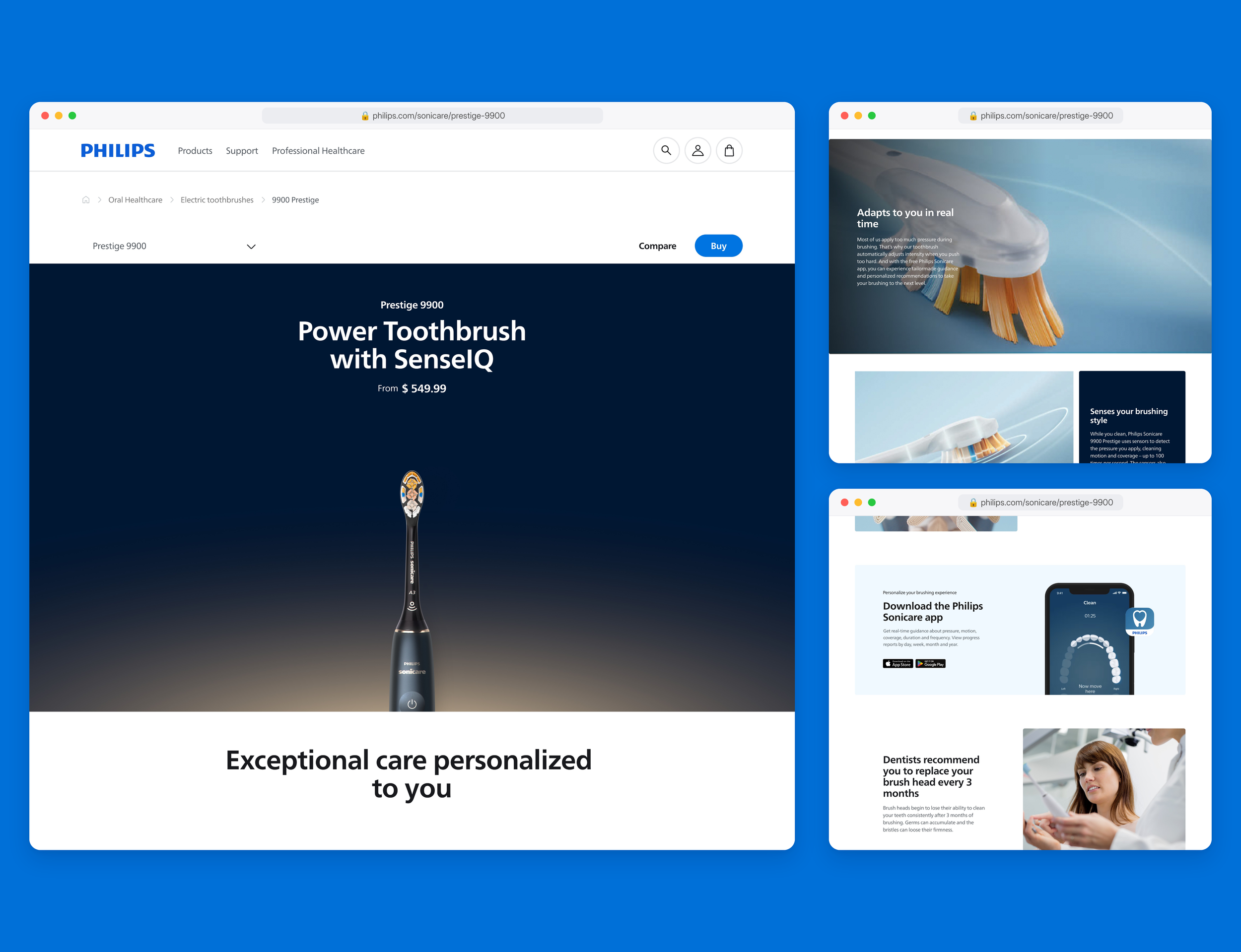
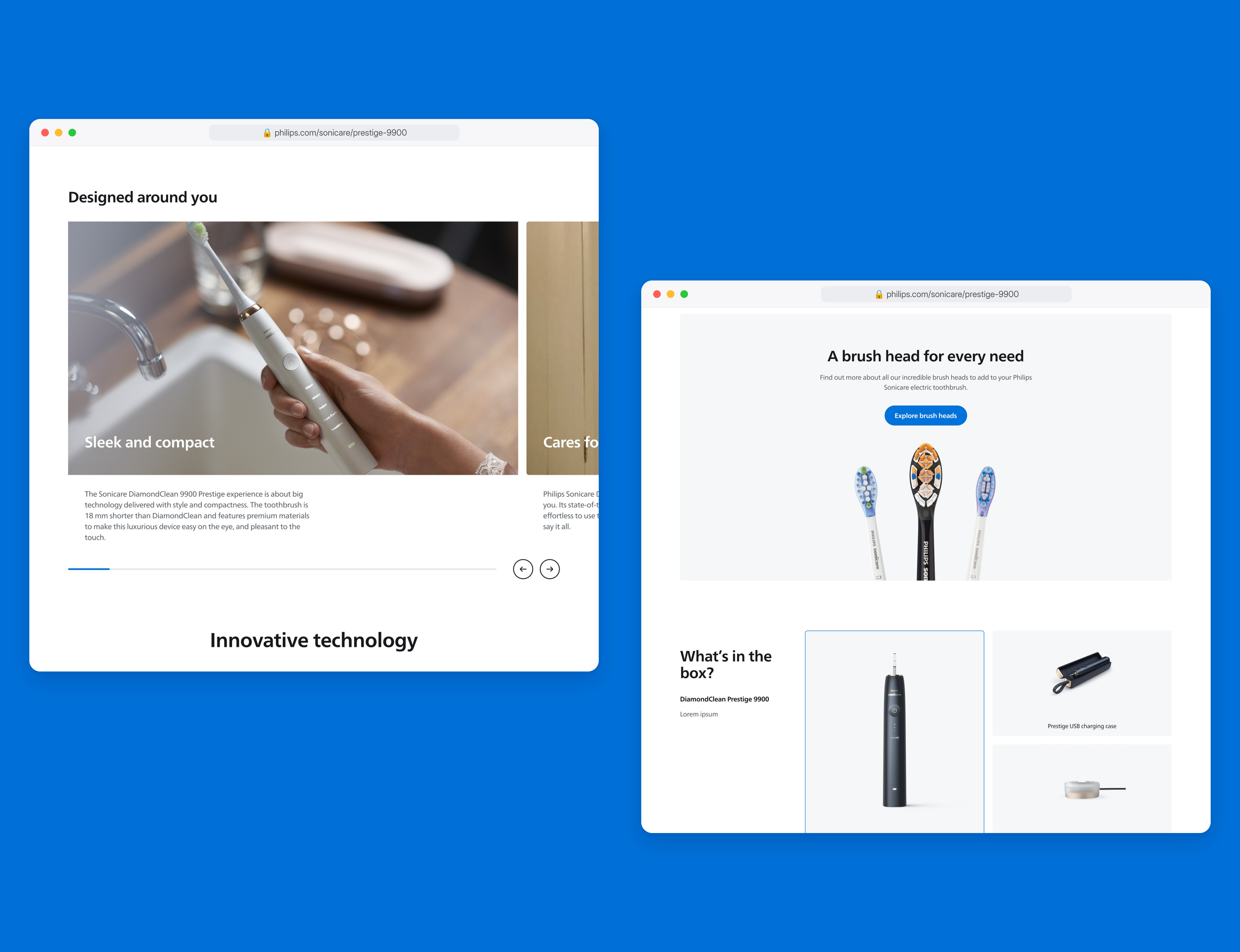
I owned the explore page for every business unit, from oral care to hair removal. Its job is to turn interest into confidence: it tells the story of one range, explains the technology in plain language and shows the price upfront, so customers never have to go looking for it.
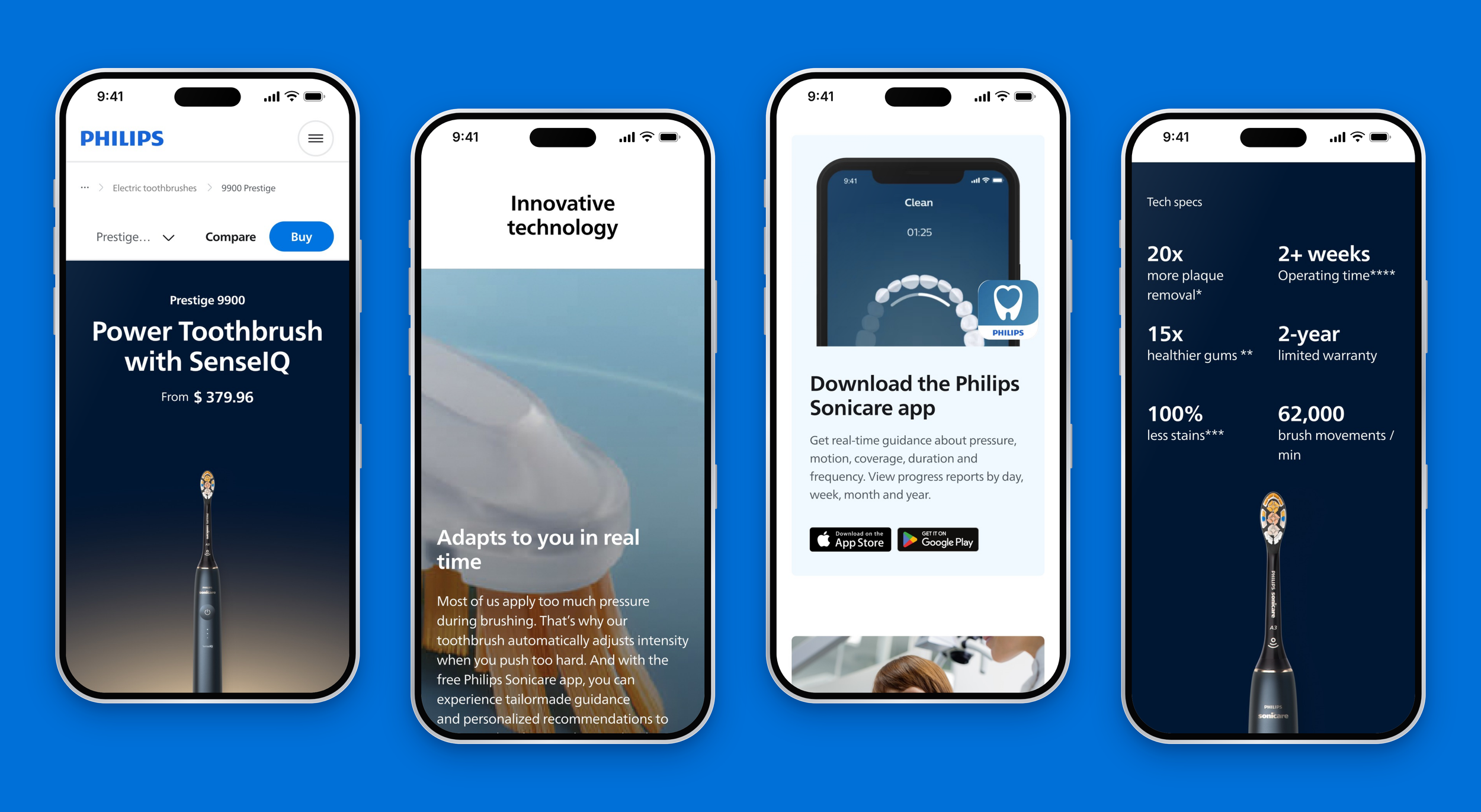
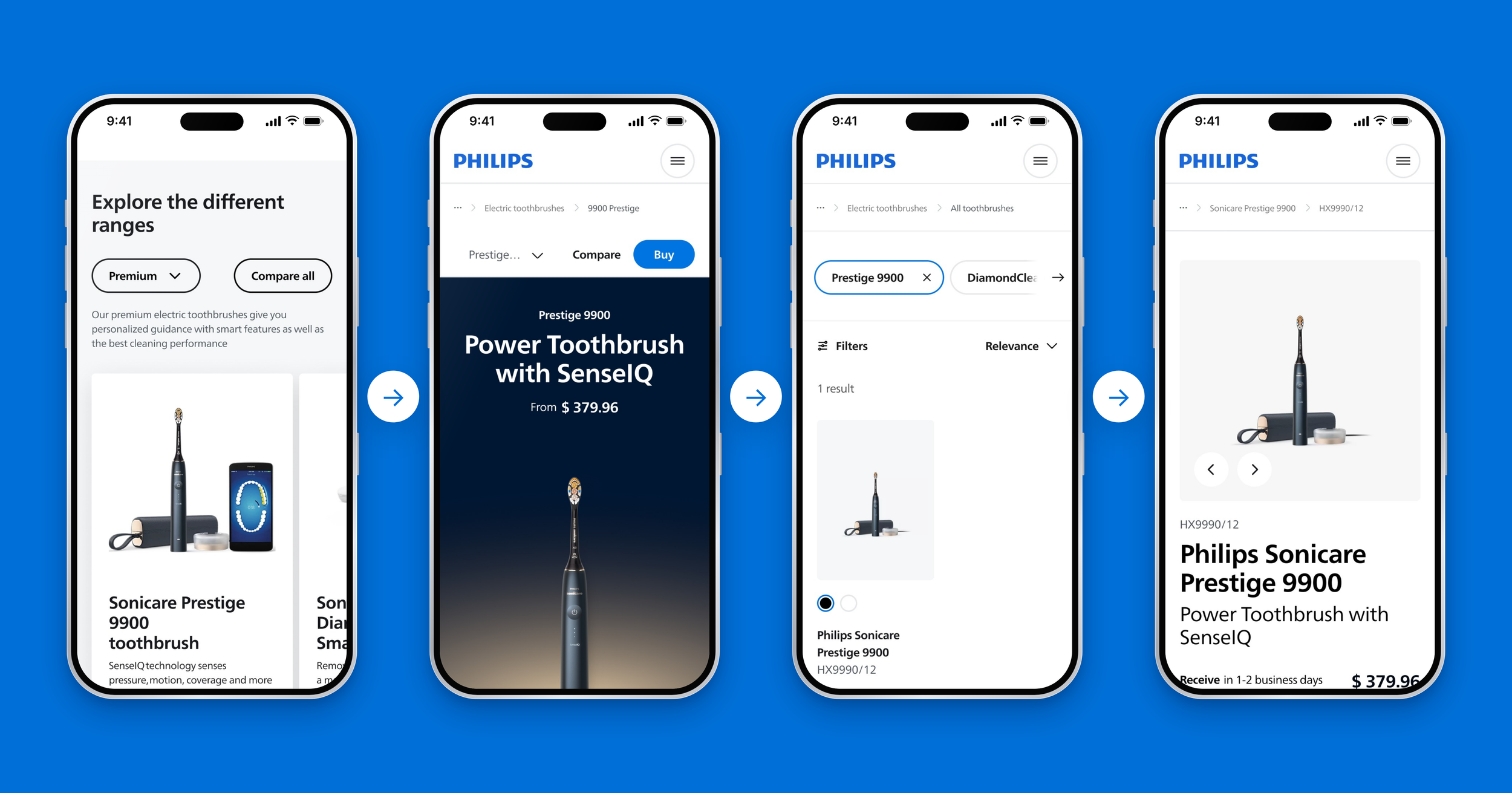
On mobile, a sticky bar keeps “Compare” and “Buy” in reach at every moment, so the decision to buy is never more than one tap away.
One system for every business unit
We mapped the full journey from category to cart and broke every page into regions for navigation, education, comparison and conversion. Every region is a reusable GenX component, so a business unit builds new pages from proven parts instead of starting from scratch.
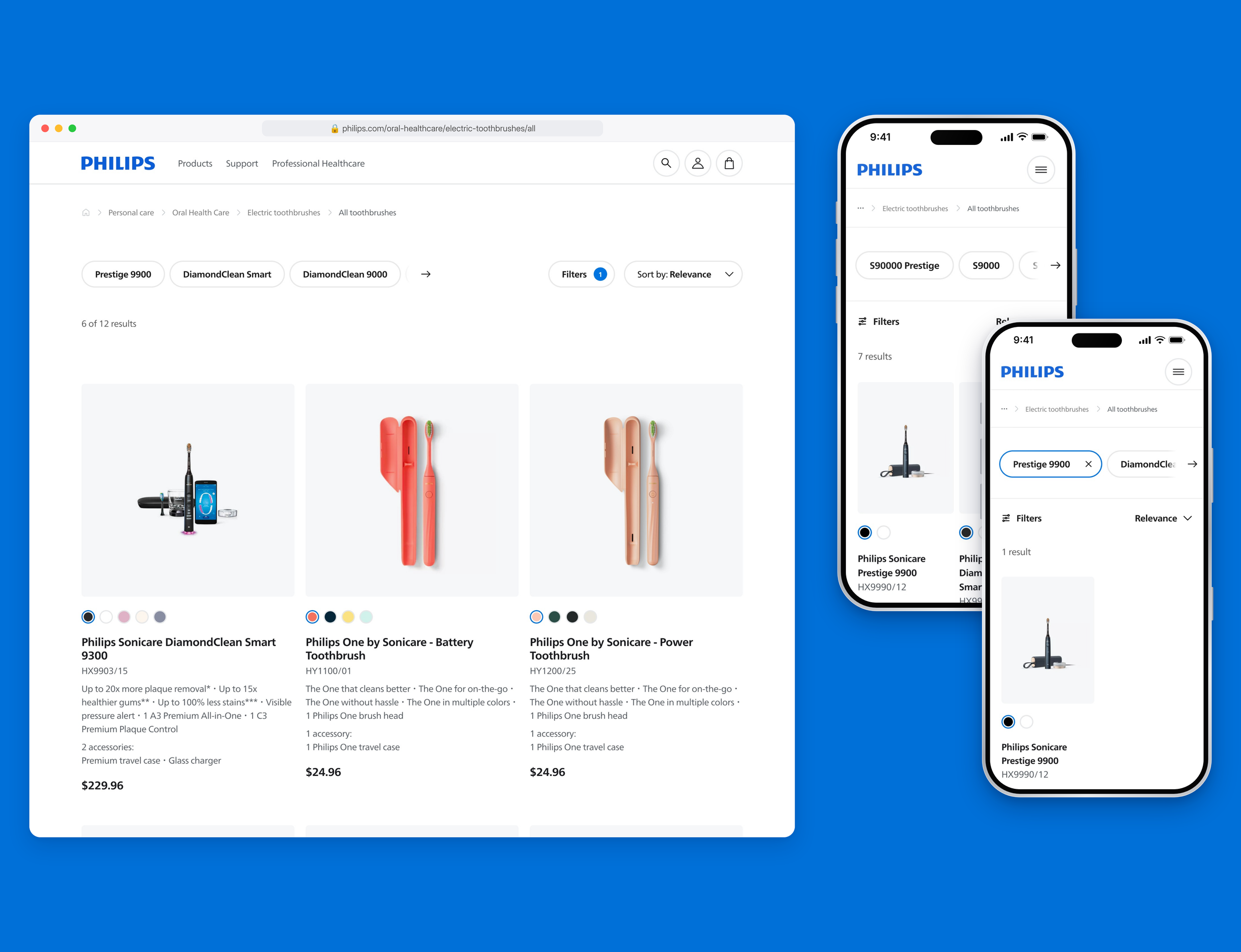
Product list
Users missed prices and filters when browsing. The new product list shows the price on every card and lets customers filter by range, and when they still doubt, a compare banner helps them decide instead of leaving.
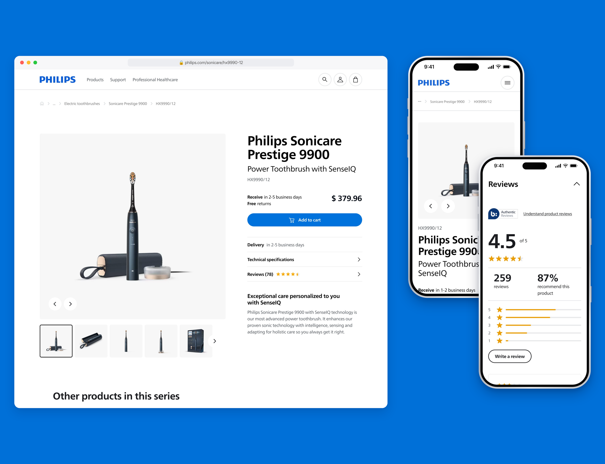
Product page
In our tests users missed delivery information. The product page answers that right next to the buy button: delivery time, free returns and add to cart in one view.
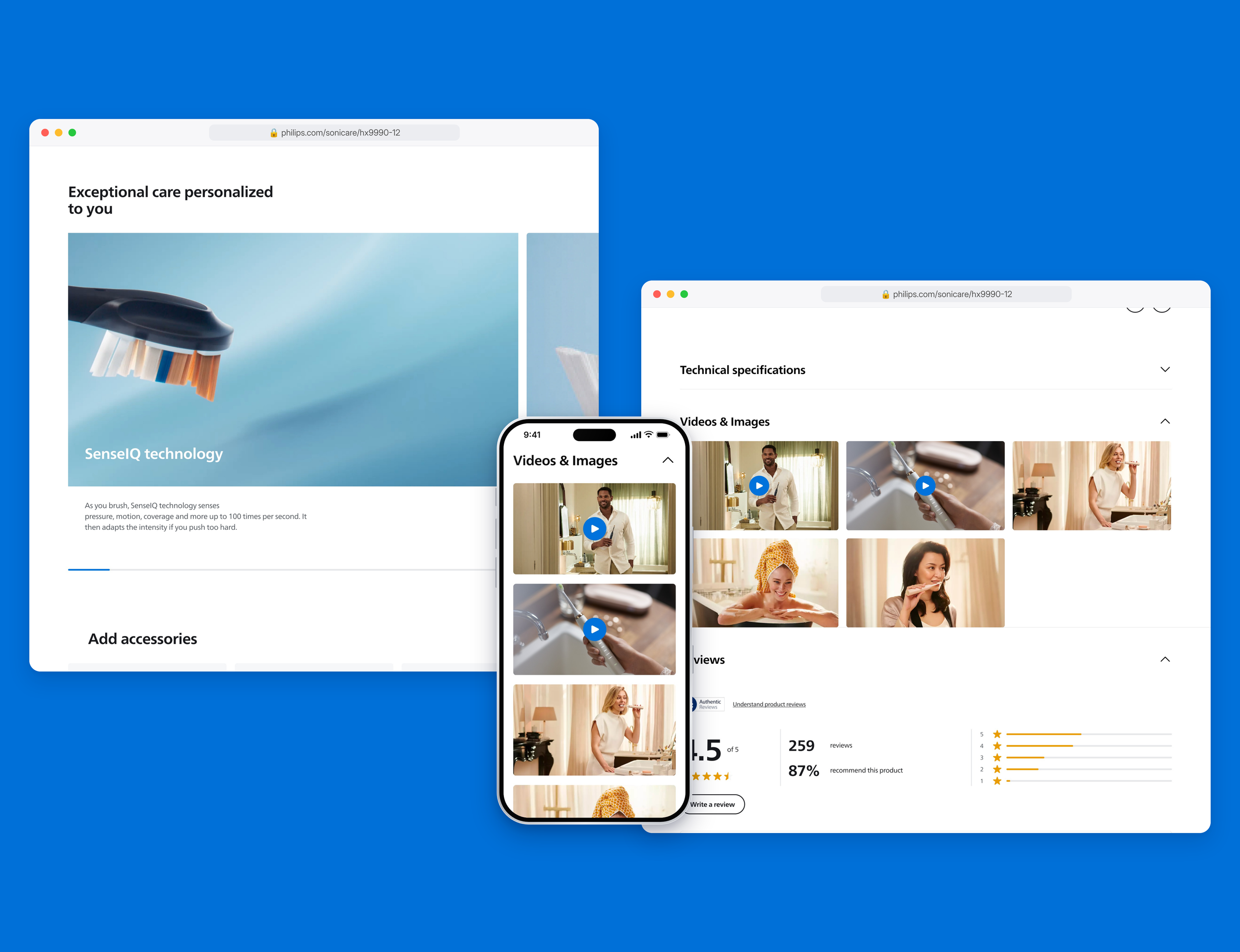
Trust came up again and again in our tests. Below the purchase area (price, delivery information and the Add to cart CTA), social proof like reviews, ratings and product videos gives customers the reassurance they need to buy.
Brush heads
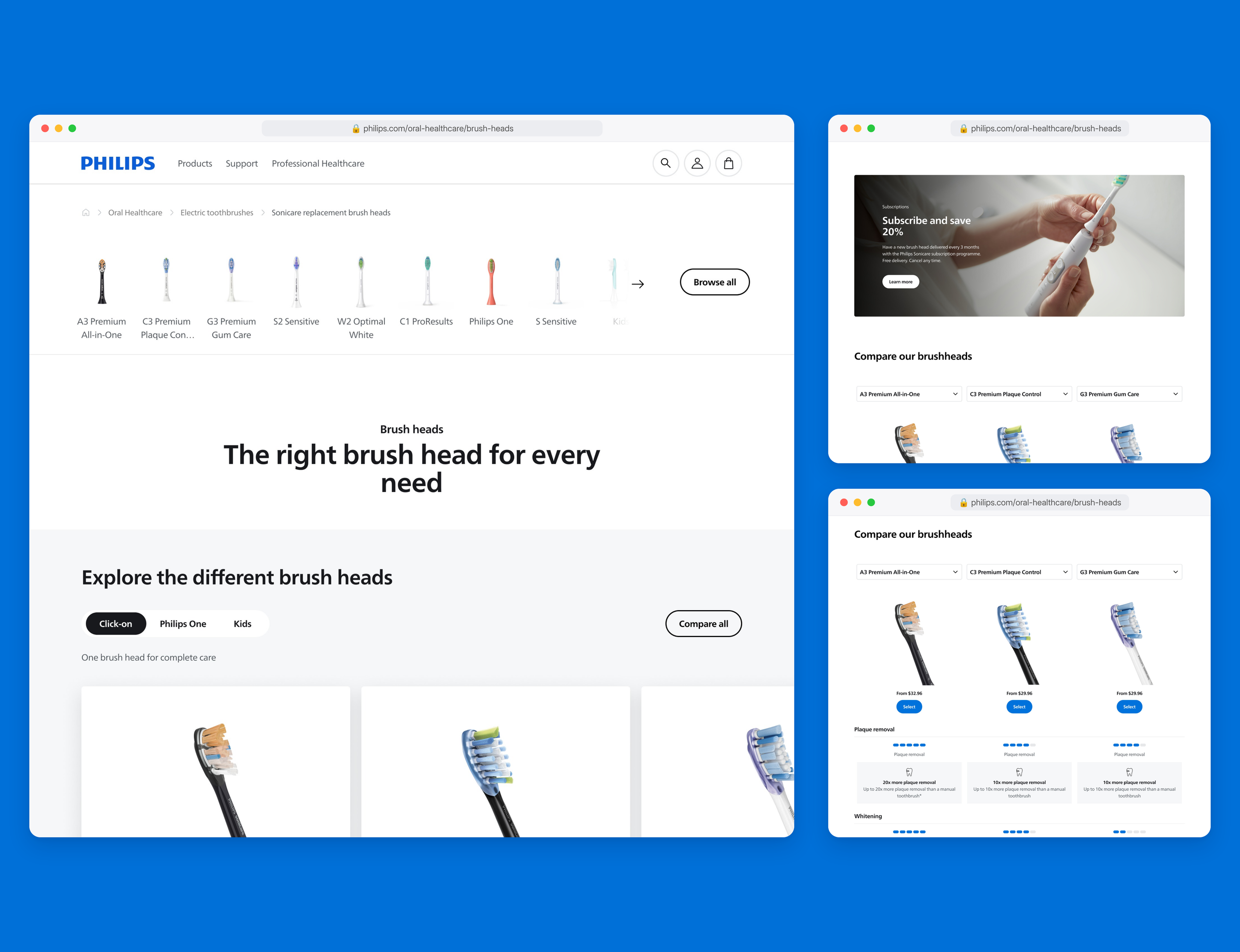
The real test of a design system: could another category be built with it? The brush heads category was built entirely from existing GenX components, including a subscribe and save offer that brings customers back every three months.
E-commerce buy flow
Fewer barriers between choosing and buying: from range card to explore page to product list to product page, with the price visible at every step.
CRO & A/B testing
Every design decision was proven with real customers. I was responsible for the CRO of all new journeys we introduced. Every new component was tested in an A/B test before it became part of GenX, so each win applied to the whole of Philips.com, not just one page. The loop: a hypothesis from data and user tests, a validated design, an A/B test on live traffic, and the winner rolled out across every business unit.
Lumea IPL
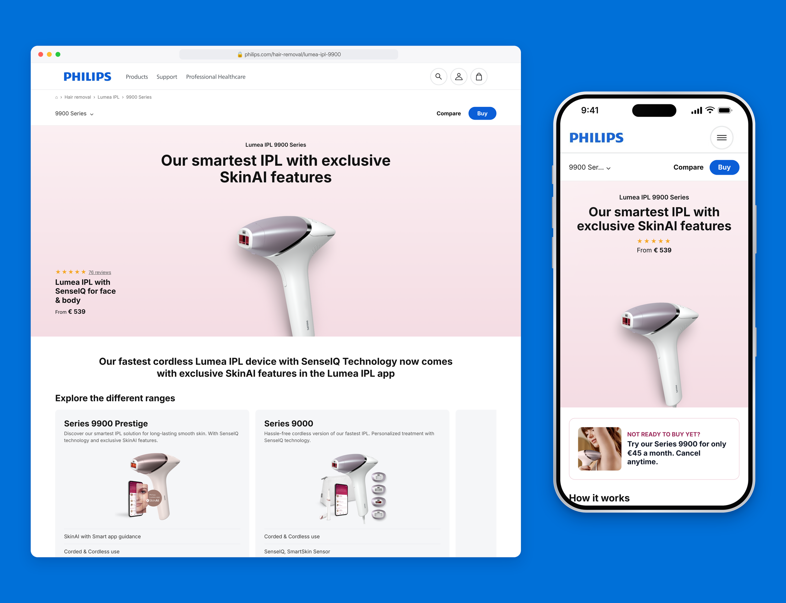
For laser hair removal the challenge was trust and understanding. The explore page puts rating and price in the header, range cards show the key differences, “How it works” explains IPL in plain language and Try & Buy is presented as a monthly plan.
What the user tests told us
Price was the most requested information on the category page.
Try & Buy needed a clearer explanation.
Influencer imagery felt unrealistic to users.
“How it works” helped users explain IPL themselves.
“I would definitely wanna know if it’s safe … and what the technology is.”
Participant, Lumea user test
The redesign went live on Philips.com in May 2026 as part of a full replatforming.
Skills
Design systems
A/B testing & CRO
User testing
Google Design Sprints
E-commerce UX
Stakeholder management
Strategy