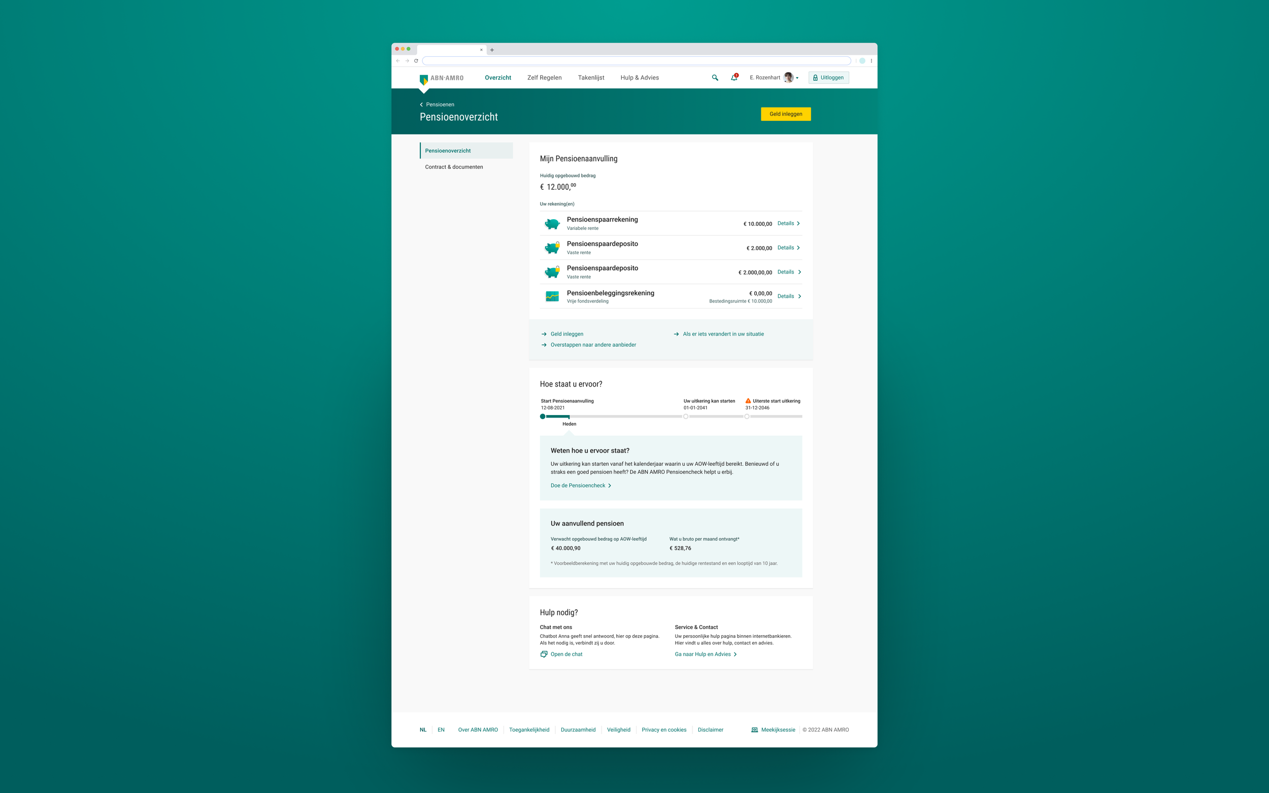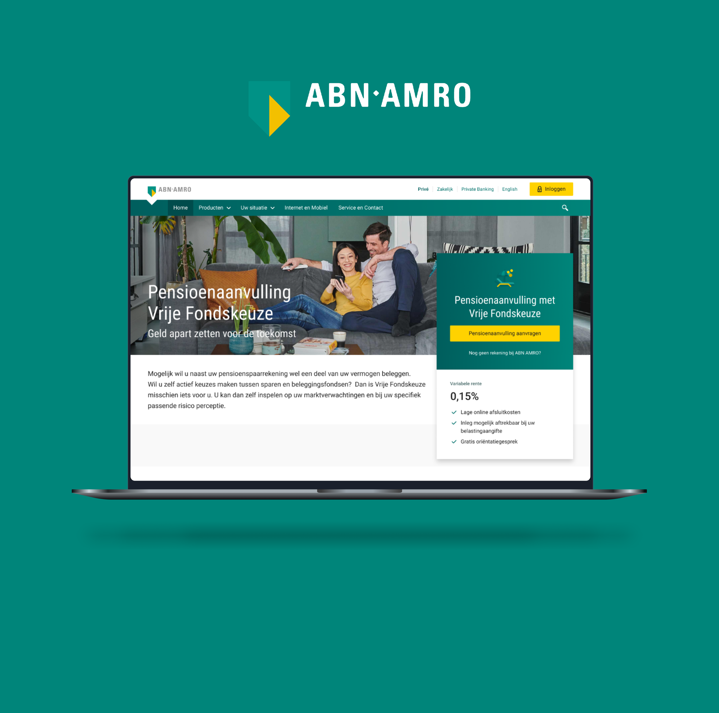
A brand-new online environment where ABN AMRO pension clients can open, view, invest in and manage their pension, designed to be simple, transparent and easy to understand.
Challenge
ABN AMRO's Pensions team needed a new online environment for pension clients. Until then, clients could only choose a savings product. The bank wanted to add investing, with two options: a fixed product where the bank picks the funds, and a flexible product for clients who want more control and accept more risk.
Goal: one clear environment for requesting a pension, investing, monitoring your balance and, at retirement, pay-outs.
My role
As Senior UX Designer I designed and user-tested the main product flows: requesting a pension investment product, the pay-out flow and the pension overview. I also facilitated the workshops that shaped the team's 2023 roadmap. The flows were tested again and again until the platform was successfully migrated.
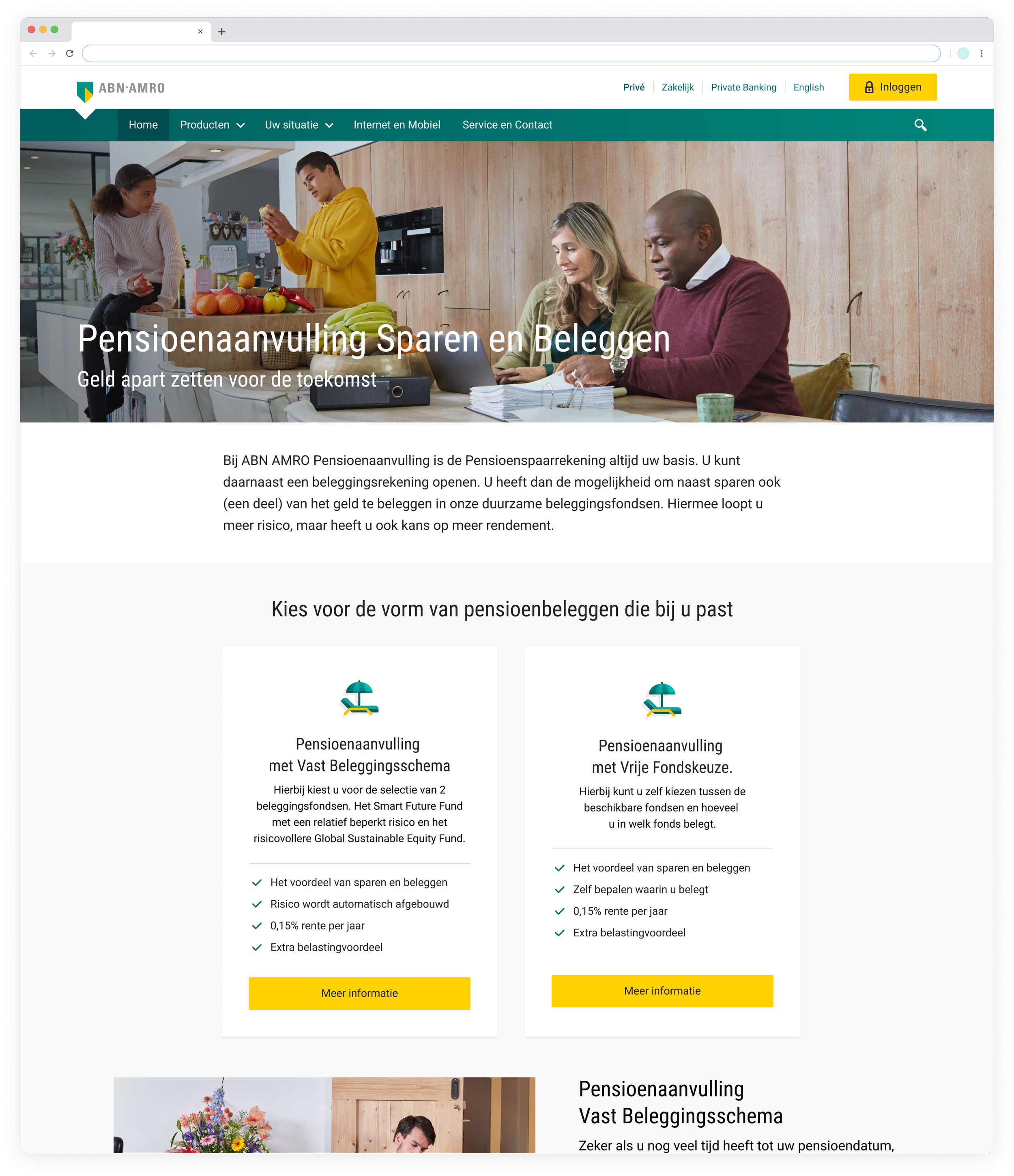
Request a pension investment product
Requesting the product is a long flow. Clients must also open a bank and savings account and complete three mandatory questionnaires: pension knowledge, investment knowledge and US tax status. My biggest worry was that people would drop out halfway and conversion would suffer. Instead of guessing, I tested it.

This is a part of the whole Pension request flow. It didn’t even fit the screenshot.

And it also needed to be prototyped so I could test it during User Testing.
User research
I tested whether users understood the questionnaires, whether the flow felt too long and what they would improve. What we learned:
The length was not a problem. Users expected to fill in a lot for a pension, and the progress bar showed them how far along they were.
The questions felt familiar. Users knew this type of question from other investment platforms and found them reasonable.
The copy gave the answers away. Users could often guess the right answer without knowing it. That led me to dig into biased questions and the psychology of questionnaires to improve the copy.

This is the introduction screen in which clients see the different steps they have to take in order to request their investment pension product. This screen tells customers they also need to open a bank account beforehand and introduces them to all the steps.
Knowledge test
This mandatory test checks whether the product suits the client, for example whether they need this money for daily expenses. I used collapsible containers so all questions fit on one screen, which makes the test feel much shorter. Built with the ABN AMRO design system.
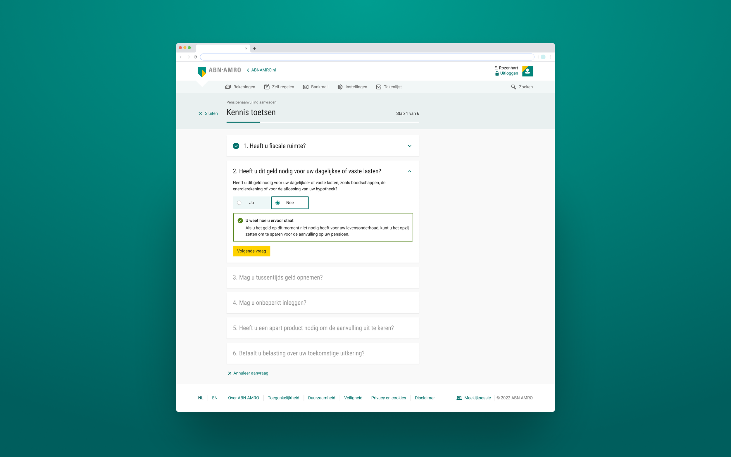
1. Pension knowledge questionnaire
Investment questionnaire
One question asks whether clients feel nervous about investing. In user tests people loved it: it made the bank feel more human and empathetic.

2. Investment knowledge questionnaire

Add money to your pension
Clients can deposit using their jaarruimte (the yearly tax-friendly allowance), transfer from another bank or insurer, or add money from a former employer's pension contract.

To open an account there are some costs that need to be payed. This happens in the same flow. We ask from which account this payment can be done.

The customer can check all their information and read the important documents. If they change their mind they can always edit any details and go back to change this quickly.
Confirmation
After signing, a positive confirmation screen explains what happens next, and clients can add money straight away.

Pension overview
The new product shows up in the Pension Overview, where clients see their balance, check how much they need to invest for a good monthly income after retirement, and change their products.